Getting the paint scheme right on your street racer is critical as this will define its final look and be costly to change…
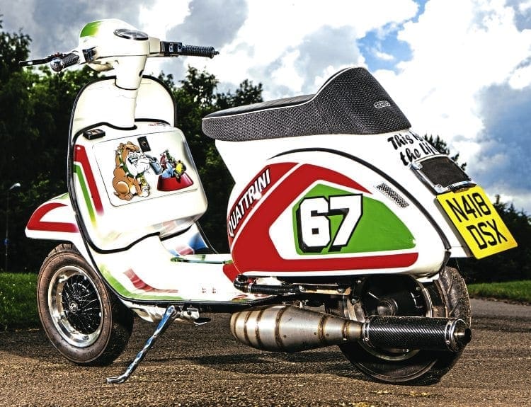
Having done all the fabrication and dry build to your street racer, the next stage is to get it painted. This needs to be carefully thought out, making the design as accurate and close as it can possibly be to the finished article. Though the paint scheme doesn’t make any difference to the performance it does to the looks. Get this part of the build right and you can be assured that your street racer project will have a successful conclusion.
Choose a base colour first
The easiest way to start is by choosing the base colour. This is what will lay over the majority of the bodywork and what any other colours will sit on top of. There is no given rule on what colour to use but some definitely work better than others. A lighter colour is better to make everything stand out and by far the best is white. With a white background, stripes, patterns and logos will stand out much more clearly.
Enjoy more Scootering Magazine reading every month.
Click here to subscribe & save.
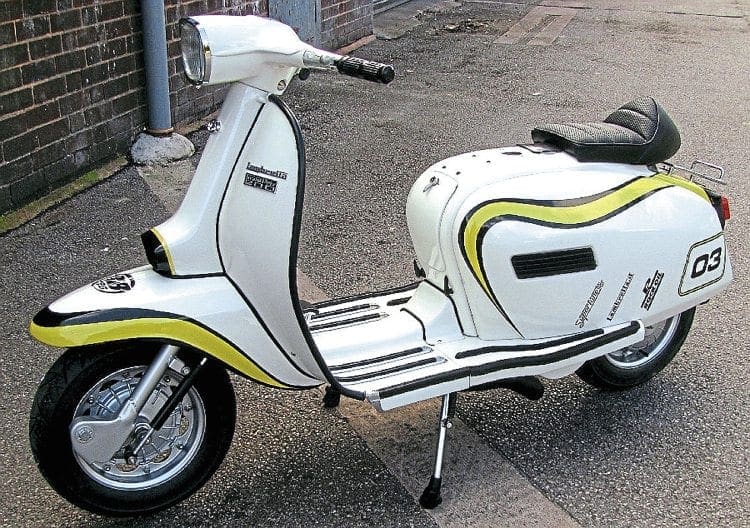
Also white is associated with cleanliness and anything painted that colour will have an organised look. If you look at the grid of cars or bikes at the start of a race a machine that is predominantly white stands out far more than ones that are painted a dark colour. If you are going down the light coloured base route then it’s difficult to change the colour too much without it starting to look washed out.
Another thing to remember is there will always be black in any scheme because of the colour of the tyres and more often than not the exhaust and the rubber trim. White and black naturally offset against each other so they are a particularly good match to use.
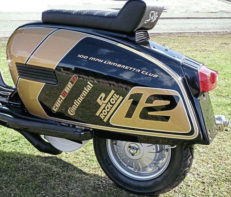
Choosing a dark base colour is fine but again you need to be careful as some shades just don’t seem to go with anything. Fundamentally you would start with black as the base which again can offset light coloured overlays. Colours to be avoided or aware of are British Racing Green and burgundy. Though both can look good on vintage cars neither have a modern feel about them.
Another area to avoid is football team colours. Though they are fine on a football kit, the often complicated design is difficult to get right on scooter bodywork. Something else that isn’t always noticed is they use plain colours due to being on fabric. Using such colours can give an old-fashioned and dull look. This brings us on to the question of depth and body within the paintwork itself.
Take a look at any modern day car or motorcycle and the paint will be metallic. Not only that, it will have a sort of deep feel to it that almost looks like you could submerge your hand into it. Compare that to an old Vespa or Lambretta with plain paint. Though clean looking, they have no real depth to them. That is what any standard scooter looks like and what we associate them with. Spray one in a modern metallic finish and the look is totally transformed. Using a Lambretta GP as an example, the 50-year-old design was modern when it came out. If the paintwork is changed to deep metallic the design of the scooter still doesn’t look out of place today. The only time you really want to use plain colours is when you go for the retro look. A scooter painted in the 1960s or 1970s only had plain paint as did any other road going vehicle during that period. Using a metallic paint on a retro-themed scooter doesn’t look right because it wasn’t used in that era so looks out of place.
Use the right colour combination
Presuming you have made your choice of base colour the next thing is to choose the right overlay colours to go with it. This is where you can easily get it wrong by using the wrong shades which won’t stand out or look rather garish. The easiest way to think about it is to use a simple set of rules of which colour goes with which. Though you can deviate or alter it slightly, by sticking with that rule it will be difficult to get it wrong.
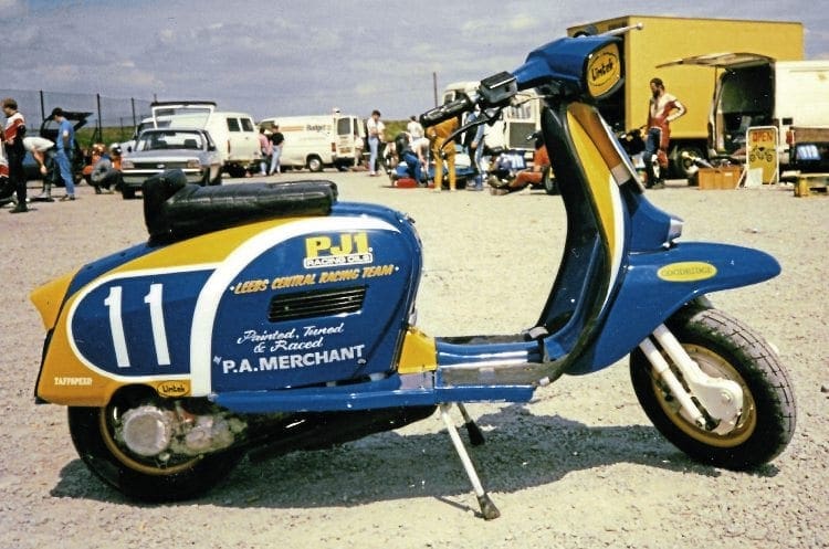
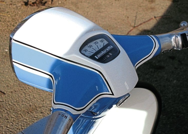
As an example of how this works let us presume the base colour is black. Colours that go with black and stand out are white, silver and gold. Using any of these, whether it is for block work, pinstriping or logos, will ensure a great combination that stands out. If you use colours such as red, blue, green or yellow for instance they will either be too dark or too opposing, so they look wrong. Now imagine the base colour is white. This will give you more choice as almost any other colour stands out from it. However, if you use yellow, that is too close and won’t stand out enough. The same goes for light blue. The exception to that rule is if you use other shades of the same colour – for example white with light blue and dark blue. These are a good match but only if used altogether. By adopting this rule of thumb it is much easier to work a scheme out in your head and know it will work.
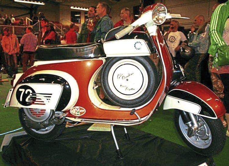
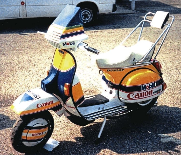
There are thousands of colour combinations out there and what is described in this article is only a guideline to getting it right. Another thing that will help is using the three colour rule. That means exactly what it says – by only using three main colours and no more. Using more than that starts to make the scheme complicated and often colours start to clash. If possible, only ever use three colours with the exception of another one such as black for pinstriping or outlining a number block for instance. If you look at some of the most iconic colour schemes in the past they never used more than three colours yet they remain in our minds when we think of something that looks associated with performance. Good examples are the red and white McLaren, black and gold JPS Lotus or the Williams Martini Formula 1 cars. They used two or three colours at most but are probably the most remembered schemes in history.
Easy influences
While it is good to think up your own colour scheme, chances are it will have been used somewhere else in the past. Don’t worry about it and remember that although it may have been used on another vehicle before it may not have been used on a scooter until now. Looking at what has already been done will show you what works and what doesn’t. Taking a scheme you like and interpreting it on to the lines of a scooter may make it look even better. It’s your take on an existing scheme and adapting it suit the contours of your scooter may enhance the idea.
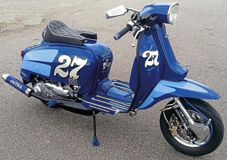
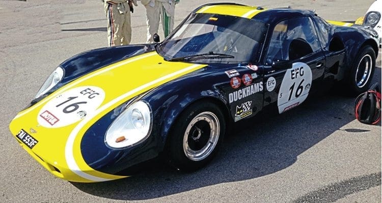
So where are the best places to get ideas and draw inspiration from? The first place to look is racing machines. It can be anything from a car to a motorbike to a power boat – it doesn’t really matter. Ever since the 1960s, when sponsorship really started to happen, vehicles have become brighter and bolder to show their advertising. This is a ready source of inspiration and definitely the main source of ideas. You will also be able to see where different colours work together and where they don’t. Teams that have big sponsorship will always want maximum exposure within the media. By placing logos of one colour on to another they have to get it exactly right so it’s clear to see while being filmed racing around a track at high speeds. Sometimes the designers do get it wrong or they try to incorporate a well-known brand logo and it clashes with their team colours. You can soon see where a scheme has been laid out well. The other benefit of using racing machinery as a source of inspiration is that it is constantly changing. Look at any team and chances are they will change colour from season to season.
The other great area to look at is packaging: from cigarette packets to aerosol cans and alcoholic drinks. Remember, these companies want to have maximum impact against their rivals. If you look at products of several different companies on a shelf, you are drawn to the one that looks the best design and colour regardless of what’s inside.
Companies use big budgets for advertising and branding so let them do the work for you with colours and logos which you can then simply interpret in your own way. Our whole world surrounds us in a daily barrage of advertising and the more you look the more you will be able to spot usable ideas.
How to explain what you want to the painter
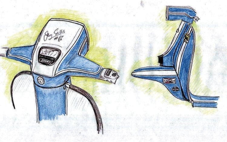
So let’s say you have your idea of how you want your scooter to look both in terms of the colours it will be and what artwork will be present. Though you have the idea in your head, the person painting it (assuming you’re not doing it yourself) doesn’t. Though you can explain it to a certain degree, it’s not always easy to get the fine detail across. The best way to explain is to draw it up on paper.
If you are good at drawing then it’s possible to do it yourself – but if not there are templates for the side and front views of scooters available to use on the net. Buy a set of coloured pencils and basically colour and draw in everything you want to use. The painter will then have a much clearer vision of what you are trying to achieve. Quite often they will then be able to advise you – perhaps moving a logo slightly so it fits better on a panel for instance. He may then ask if you want a tramline around your number block or shading around a logo to lift its appearance. By doing a design this way, between both parties can agree on an idea that should be easy to work out. You will then know exactly how the finished product will look and have no worries that you got it wrong.
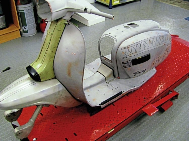
Another way of helping with the logos and lines on the paintwork is to draw it out on the scooter in the first place. Presuming you will be doing a dry build there should be a stage where the bodywork is fully built. Though you won’t be able to choose colours, as more than likely it will be in primer, you can at least lay the artwork out. Using an instant marker, draw out whatever it is you want to use across the bodywork. It doesn’t matter if it’s not right in the first place – clean it off and do it again. This will give you the best way of seeing how everything will lay out. The painter doesn’t need to be present just take plenty of photos for him to see afterwards. By using this method you should know exactly where everything is going to lay on the bodywork and that it all fits perfectly.
Do’s and don’ts
When it actually comes to choosing the paint, getting the shade exactly right can be a bit of a pain. Every colour can have several shades and in the case of white a great many more. If you are using white then try not to use the most brilliant and brightest as it will overpower the colour it’s set against. Go for a slightly off-white to prevent this from happening. With any colour you are using, don’t go for something that is too garish and use a more subtle tone or shade of each particular colour within your scheme. Again, as you look at the influences described earlier you will notice that all the colours used tend to complement one another rather than one being bolder than the rest.
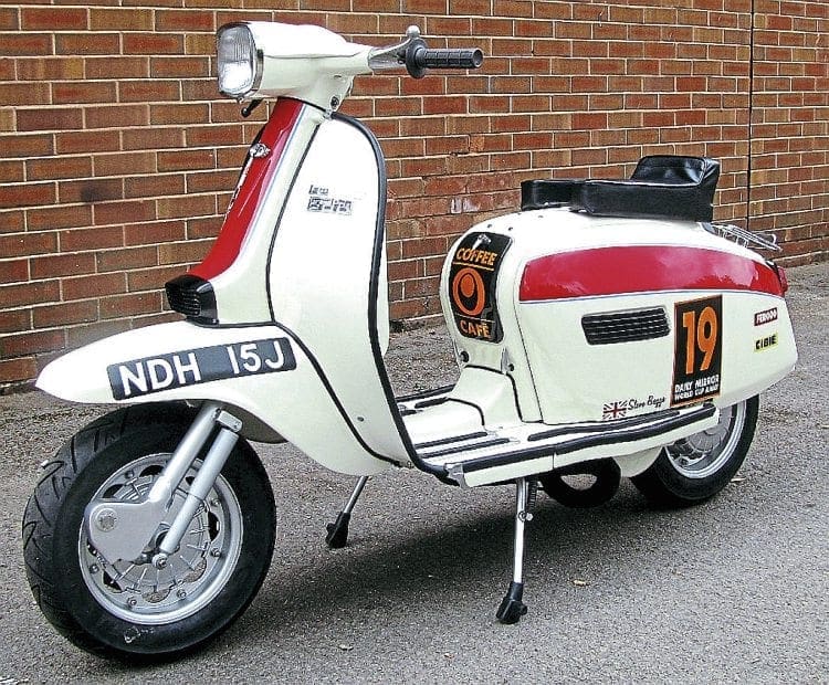
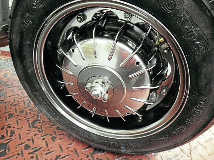
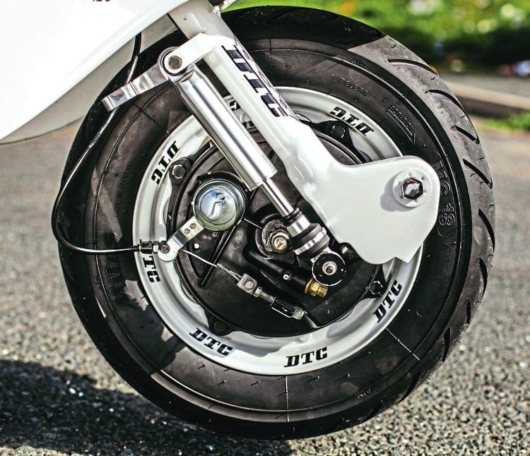
Often overlooked is the running gear on a scooter. This is primarily the hubs, rims, forks, and stand. The simple answer to this is to paint them silver, which not only offsets them perfectly against the main bodywork but also hides such things as the stand as much as possible. The forks should always be painted in the most neutral colour available and while sometimes the hub may be black, depending on the braking system, the rims categorically need to be either silver or white. Painting the wheel rims any other colour will make them stand out like a sore thumb. Under no circumstances should you paint the rims black as this will make them blend in with the tyre and make the walls look too big, giving a rather strange look.
When it comes to choosing the actual paint itself, that needs to be discussed between you and the painter. Use the best paints possible and when looking for ideas go on to manufacturers’ websites and look at their choices. Most will have a colour chart that often, when you chose a specific one, will change the vehicle you are looking at to that colour. This will give you plenty of ideas, especially when it comes to choosing the base colour. Try to use the best manufacturers if possible as their choice certainly of metallic paint is far greater. An example is Ferrari, who spend a significant budget each year on paint research. With cars produced costing a significant amount they constantly need to improve their paint or come up with new ideas and are an ideal source to use.
Any street racer scheme that has airbrushed logos will involve many man hours to create and come at a certain degree of expense. You want to get it right the first time and for it to look perfect. Rather than just choose the colours you are going to use, get a sample of each one first. Ask your painter to spray something small like a toolbox door, for instance, in the colours you are using. Sometimes when you look at one on a chart it doesn’t always look the same when it’s actually laid down on the bodywork. By doing this you will be able to make sure the shade is exactly right and that it blends well with the other colours you have chosen. If something needs changing now will be the time to do it and with the sample only costing a small amount it could save you a lot of money and heartache later.
Finally, listen to what the painter has to say. Sometimes you may have an idea which you will think looks good but they will see that possibly it isn’t. Remember, it’s their job – daily working with hundreds of different colours and shades. They may look at your choice and suggest only a subtle change that will enhance or improve the overall look. Whatever their views, listen to them as more often than not they will help in getting it right. Just because you have an idea of how you want the paint scheme of your scooter to look in the first place doesn’t mean to say that you can’t alter things. There is certainly no rule which says that you’re not allowed change your mind and if someone else’s input improves the final result even more then that’s all that counts.
Next month: The engine
Words: Stu Owen
Photographs: Many thanks to Dave Omerod, Martin Murray Stu Owen and the Kev Walsh collection


